common

Photography

Vignette: Mitch Eckert


Art ,“born out of frustration,” — Mitch Eckert


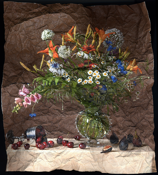
Like many artists, Mitch Eckert works in several different veins. Here we examine some examples from his Translations series. Eckert explains that he has been exploring the genre of still life for 25 years, and in these images we see him emulating the lighting in Flemish paintings. At one point Eckert had sought to discard the project and placed the work prints in a recycle bin – a purging action more common than the lay person might assume, but familiar enough to working artists. Eckert explains the process in his own words:

“Still Life with Cherries and Blue Bowl” by Mitch Eckert, 30x49in, Archival Pigment Print (2006), $1200 | BUY NOW

“Still Life with Cherries and Blue Bowl” by Mitch Eckert, 30x49in, Archival Pigment Print (2006), $1200 | BUY NOW

“Still Life with Two Nectarines” by Mitch Eckert, 38x26in, Archival Pigment Print (2006), $850 | BUY NOW

“Still Life with Two Nectarines” by Mitch Eckert, 38x26in, Archival Pigment Print (2006), $850 | BUY NOW

“The Translations series was born out of frustration. I wanted to participate in a dialogue with the rich tradition of the Dutch masters of still life painting so I set out to learn compositional strategies of creating still lifes in that manner. I set up the floral arrangements (my wife made the bouquets from our garden flowers) and using natural light made probably 300 photographs of different still life. After printing them all on an inexpensive inkjet printer to pin them on my wall and contemplate, I came to the realization that perhaps they were too commercial, too pretty. As a student in the heyday of Postmodernism (1980's) I became anxious and nervous about making work that was too pretty. I didn't know how to talk about them. I didn't want to make commercial work.”

“Out of frustration I wadded up the prints and threw them into the recycle bin. After a couple weeks had gone by I was getting ready to set the crumpled photographs into the alley for the recycle to be picked up. I unraveled one of the balls of photographs and to my surprise there was an immediate visceral reaction of delight when my eyes looked at the creases, folds, and torn edges of the photographic paper. In an effort to preserve the image I scanned the crumpled still life with a flatbed scanner and then, using a large format printer, made enlargements on a wonderful printmaking paper that wonderfully complimented the aged wrinkles.”

“Still Life with June Bouquet, Cherries and Figs” by Mitch Eckert, 24x18in, Archival Pigment Print (2006), $450 | BUY NOW

“Still Life with June Bouquet, Cherries and Figs” by Mitch Eckert, 24x18in, Archival Pigment Print (2006), $450 | BUY NOW

The results blur the lines of the medium by removing the slick surface and detail of photography and exchanging them for a distressed visual texture. Without intending to do it, Eckert brought his images even closer to the aged and brittle tactile reality of their inspiration.

Examples of this series can currently be seen in Altered Perceptions, an LVA Photo-Biennial Exhibit at Metro Hall, which runs through January 12, 2018. Some of the images we see here are featured in that show, which also includes work from C.J. Pressma and Jenny Zeller.

The artist currently lives in Louisville, Kentucky where he is an associate professor or art in the Hite Institute at the University of Louisville. His work can be found in permanent collections of 21c Museum, Butler Institute of American Art, Indianapolis Museum of Art, the Photographic Archives at the University of Louisville, and Swope Museum of Art.

Hometown: Indianapolis, Indiana
Education: BFA, Photography & Sculpture, Herron School of Art; MFA, Photography, Printmaking, Art History, Ohio University
Website: http://www.mitcheckert.com

“Still Life with Hydrangea (in blue)” by Mitch Eckert, 30x28in, Archival Pigment Print (2006), $750 | BUY NOW

“Still Life with Hydrangea (in blue)” by Mitch Eckert, 30x28in, Archival Pigment Print (2006), $750 | BUY NOW

“Still Life with Lily and Figs” by Mitch Eckert, 24x18in, Archival Pigment Print (2006), $500 | BUY NOW

“Still Life with Lily and Figs” by Mitch Eckert, 24x18in, Archival Pigment Print (2006), $500 | BUY NOW

Written by Keith Waits. Entire contents copyright © 2017 Louisville Visual Art. All rights reserved.

Are you interested in being on Artebella? Click here to learn more.

Are you interested in being on Artebella? Click here to learn more.

Q&A: Dave Caudill


“My sculpture is often placed in public spaces, and it celebrates attributes that enable all of us to thrive – idealism, enthusiasm and the joy of life.” — Dave Caudill


Artist, Dave Caudill at work.

Artist, Dave Caudill at work.

Dave Caudill and the “Odyssey” project

A well-liked, long-time fixture in the local art community, Dave Caudill has several public sculptures in Louisville: at 6th & Main St, the University of Louisville School of Music, Maryhurst Alternative School, the Crescent Hill public library, and the offices of the Waterfront Development Corp in downtown. His latest project is ambitious, even for an artist who has installed a large metal sculpture on the ocean floor.

How did you first hit upon the idea of “Odyssey”?

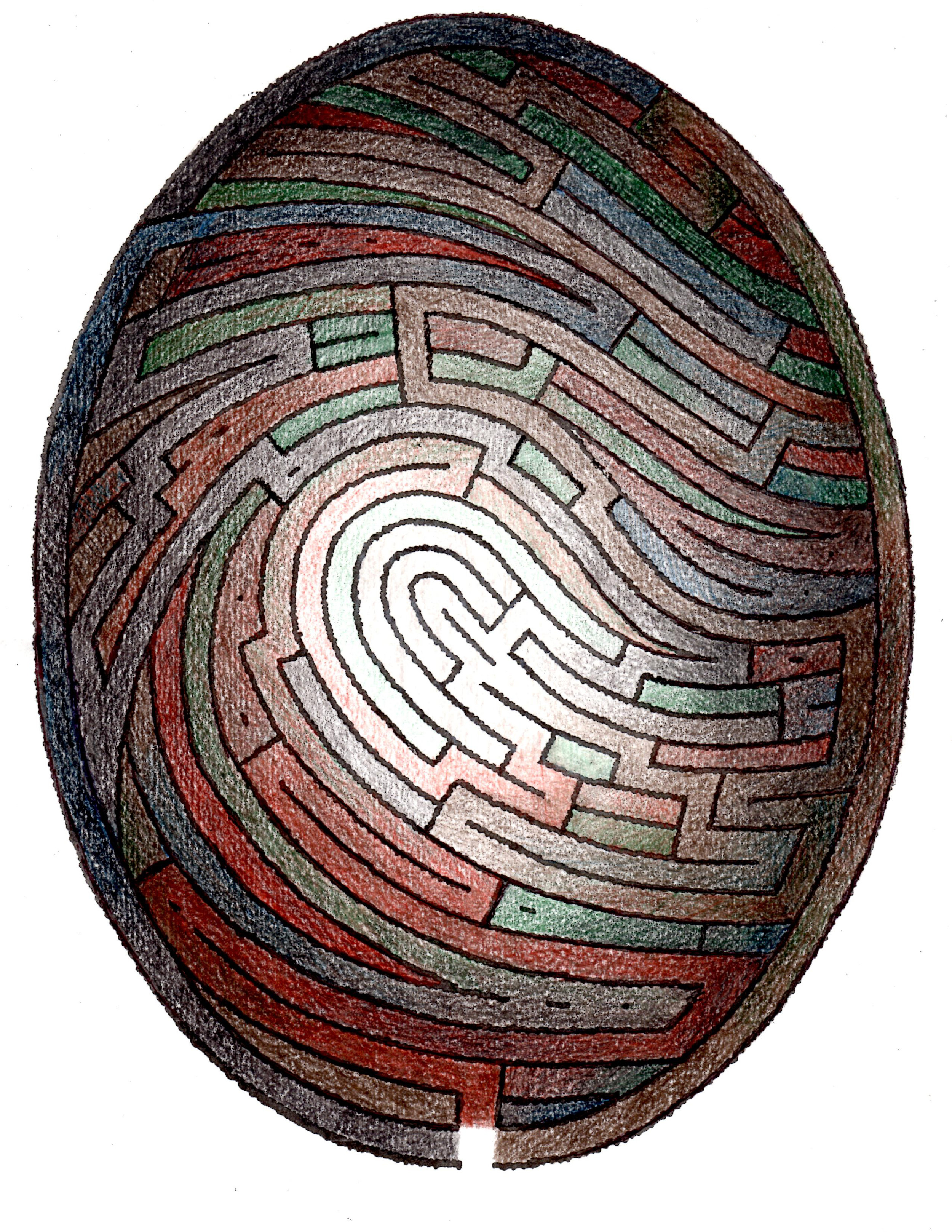
A few years ago, I realized the synthesis of a fingerprint and labyrinth could make a powerful combination that prompted consideration of identity and our individual journeys though life.

How do you think it fits in with the themes of your past work? Or does it?

I see it as another iteration of the theme of humanity in harmony with the rest of nature, a theme that I first addressed with an undersea sculpture in 1995.

Do you worry a labyrinth will intimidate people? Are people afraid of getting lost?

Labyrinth concept drawing by Dave Caudill.

Labyrinth concept drawing by Dave Caudill.

Walking a labyrinth is different from a maze, in that once you'e on a path, it takes you to the center and back out again - there is no confusion or opportunity to get confused or lost as in a maze, as long as you stay on a path. Also, everything is at ground level - there are no walls that create blind spots. This misunderstanding is common, but a small plaque at the entrance to Odyssey will clarify the difference.

We are creating a meditative walking experience fused with a bold piece of public art.

You just returned from Bolivia, where you were involved in a similar project. What was your experience there?

The Bolivian Odyssey differs from my proposal for Louisville in that it’s half the size (1/4 the size of a football field) and uses gravel instead of flat terrazzo over concrete for the paths. The Bolivian project is located in a rural area and creating a handicapped accessible design was not an option.

Who are your collaborators, and how did you connect with them?

This unique labyrinth will engage people through the consideration of identity and personal journeys through.

This unique labyrinth will engage people through the consideration of identity and personal journeys through.

I received a residency to start construction from Teresa Camacho-Hull, the owner and director of Ars.Natura.Uta, an art center near La Paz. She has been developing the center as a site dedicated to addressing the need to understand that the wholeness of our relationship to nature is essential to the health of both humanity and the planet. I met her at a sculptor’s conference in Pittsburgh, an event I was able to attend by a grant from Louisville’s Great Meadows Foundation. Teresa’s staff of three men was indispensable for a 2-week schedule.

What would be your dream location for “Odyssey”?

I’d like to see it in an area conducive to reflection and meditation, like a park. That being said, a strong design can go a long way toward overcoming the noise of an urban environment and establishing a unique asset for the city.

Hometown: Corbin, Kentucky
Age: 66
Education: University of Kentucky, 1970; Louisville School of Art, 1973; Anderson Ranch, CO, 2000 & 2001
Website: http://www.caudillart.com

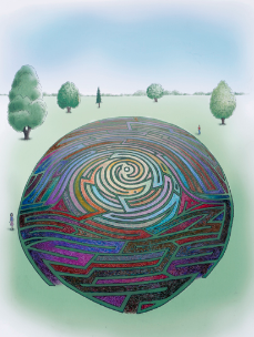
An illustration showing an example of the terrazzo artwork that would cover the concrete paths of Odyssey. Each path would be a winding, evolving, unique design.

An illustration showing an example of the terrazzo artwork that would cover the concrete paths of Odyssey. Each path would be a winding, evolving, unique design.

2017-04-29 11.05.09.jpg

Entire contents copyright © 2017 Louisville Visual Art. All rights reserved. 

Are you interested in being on Artebella? Click here to learn more.

Are you interested in being on Artebella? Click here to learn more.