reflection

Drawing

Vignette: Sarah Johnson


“Iconography has given me the opportunity to undergo a reflection and transformation…”
— Sarah Johnson


"The Holy Trinity" by Sarah Johnson, 14x22in, graphite on paper (2017)

"The Holy Trinity" by Sarah Johnson, 14x22in, graphite on paper (2017)

At this point, it is fair to say that all art speaks to tradition; even the most radical work usually sees Dadaism as an ancestor. There was a time when virtually the only way to make a living as an artist was to create religious imagery – the church was one of the only paying customers, and private collectors rarely wanted secular art, except for portraits. Iconography is not always religious, but the use of recurrent symbols and themes in churches arguably laid the foundation of how we think about such things. Sarah Johnson here picks up that tradition in designs that show fealty to the rigid, highly symmetrical compositional formula that were essential in this work, but with a soupcon of individual interpretation in the details of character.

“I have the opinion that art is supposed to reflect to its audience a message,” says Johnson. “I believe art has a very significant role to play in our daily and personal lives as well as having the capacity to influence our entire culture, spiritually and politically. The best examples of that kind of art have one thing in common: it touches the soul. I have a strong desire to share my belief and perspective and Iconography has given me the opportunity to undergo a reflection and transformation and to learn a time-tested medium. I aim to continue in my study in Iconography.”

So Johnson’s images are unabashedly ecclesiastical; a personal expression of spirituality rooted in the long and rich historical traditions employed by some of the greatest artists the world has known: Leonardo, Michelangelo, Raphael, not to mention untold numbers whose specific identity has been lost to time.

Hometown: Maysville, Kentucky
Age: 32
Education: Studied at the Art Academy of Cincinnati
Website: http://www.sarahcatherinejohnson.wordpress.com

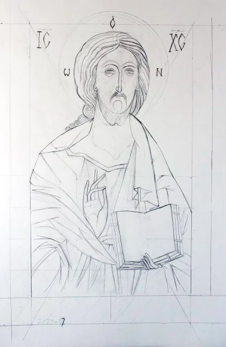
"Christ Pantocrator" by Sarah Johnson, 14x22in, graphite on paper (2017)

"Christ Pantocrator" by Sarah Johnson, 14x22in, graphite on paper (2017)

"Archangel Michael" by Sarah Johnson, 14x22in, graphite on paper (2017)

"Archangel Michael" by Sarah Johnson, 14x22in, graphite on paper (2017)

"Saint Andrew" by Sarah Johnson, 14x22in, graphite on paper (2017)

"Saint Andrew" by Sarah Johnson, 14x22in, graphite on paper (2017)

Written by Keith Waits. Entire contents copyright © 2017 Louisville Visual Art. All rights reserved.

Are you interested in being on Artebella? Click here to learn more.
Are you interested in being on Artebella? Click here to learn more.

Q&A: Dave Caudill


“My sculpture is often placed in public spaces, and it celebrates attributes that enable all of us to thrive – idealism, enthusiasm and the joy of life.” — Dave Caudill


Artist, Dave Caudill at work.

Artist, Dave Caudill at work.

Dave Caudill and the “Odyssey” project

A well-liked, long-time fixture in the local art community, Dave Caudill has several public sculptures in Louisville: at 6th & Main St, the University of Louisville School of Music, Maryhurst Alternative School, the Crescent Hill public library, and the offices of the Waterfront Development Corp in downtown. His latest project is ambitious, even for an artist who has installed a large metal sculpture on the ocean floor.

How did you first hit upon the idea of “Odyssey”?

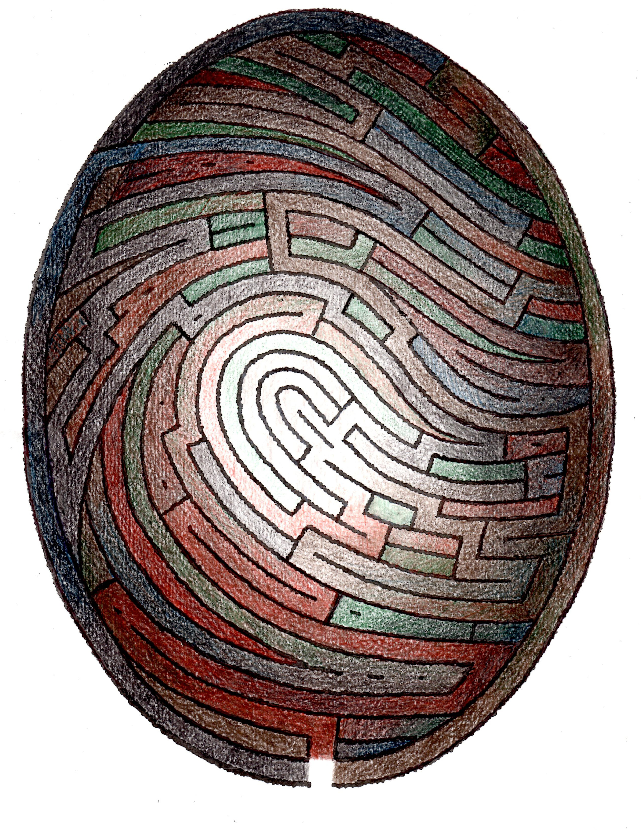
A few years ago, I realized the synthesis of a fingerprint and labyrinth could make a powerful combination that prompted consideration of identity and our individual journeys though life.

How do you think it fits in with the themes of your past work? Or does it?

I see it as another iteration of the theme of humanity in harmony with the rest of nature, a theme that I first addressed with an undersea sculpture in 1995.

Do you worry a labyrinth will intimidate people? Are people afraid of getting lost?

Labyrinth concept drawing by Dave Caudill.

Labyrinth concept drawing by Dave Caudill.

Walking a labyrinth is different from a maze, in that once you'e on a path, it takes you to the center and back out again - there is no confusion or opportunity to get confused or lost as in a maze, as long as you stay on a path. Also, everything is at ground level - there are no walls that create blind spots. This misunderstanding is common, but a small plaque at the entrance to Odyssey will clarify the difference.

We are creating a meditative walking experience fused with a bold piece of public art.

You just returned from Bolivia, where you were involved in a similar project. What was your experience there?

The Bolivian Odyssey differs from my proposal for Louisville in that it’s half the size (1/4 the size of a football field) and uses gravel instead of flat terrazzo over concrete for the paths. The Bolivian project is located in a rural area and creating a handicapped accessible design was not an option.

Who are your collaborators, and how did you connect with them?

This unique labyrinth will engage people through the consideration of identity and personal journeys through.

This unique labyrinth will engage people through the consideration of identity and personal journeys through.

I received a residency to start construction from Teresa Camacho-Hull, the owner and director of Ars.Natura.Uta, an art center near La Paz. She has been developing the center as a site dedicated to addressing the need to understand that the wholeness of our relationship to nature is essential to the health of both humanity and the planet. I met her at a sculptor’s conference in Pittsburgh, an event I was able to attend by a grant from Louisville’s Great Meadows Foundation. Teresa’s staff of three men was indispensable for a 2-week schedule.

What would be your dream location for “Odyssey”?

I’d like to see it in an area conducive to reflection and meditation, like a park. That being said, a strong design can go a long way toward overcoming the noise of an urban environment and establishing a unique asset for the city.

Hometown: Corbin, Kentucky
Age: 66
Education: University of Kentucky, 1970; Louisville School of Art, 1973; Anderson Ranch, CO, 2000 & 2001
Website: http://www.caudillart.com

An illustration showing an example of the terrazzo artwork that would cover the concrete paths of Odyssey. Each path would be a winding, evolving, unique design.

An illustration showing an example of the terrazzo artwork that would cover the concrete paths of Odyssey. Each path would be a winding, evolving, unique design.

2017-04-29 11.05.09.jpg

Entire contents copyright © 2017 Louisville Visual Art. All rights reserved. 

Are you interested in being on Artebella? Click here to learn more.

Are you interested in being on Artebella? Click here to learn more.

Drawing

Vignette: Helen Payne


“…Our identities and trajectories are shaped by tests and how testing is a reflection of power.” — Helen Payne


16422981_1753210991371648_5576869476872035792_o.jpg

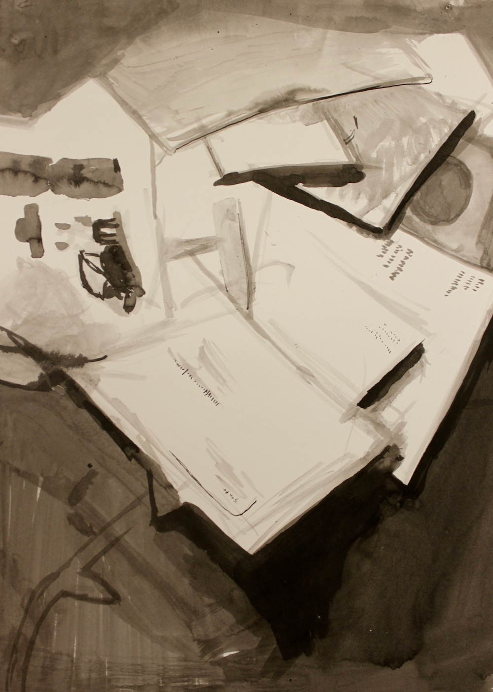
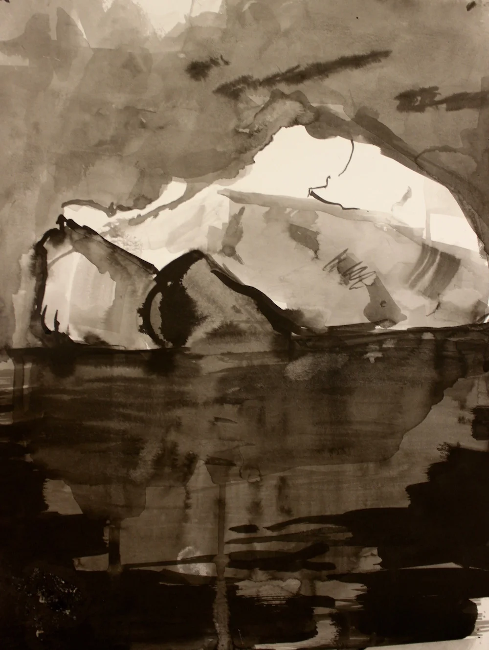
Helen Payne’s ink wash drawings occupy a fluid space between representational and non-representational, ink washes built upon a solid draughtsmenship yet rendered with great immediacy. As if each one took only minutes to complete, the artist working nimbly with her brush with an economy of effort and heightened deliberation.

The drawings are part of a series that attempts to take a fresh perspective on questions if identity and the metrics of human existence. “I work in the studio creating objects and images that help me process and understand how the world works,” explains Payne. “These days, I am thinking about ways we measure and monetize our bodies and minds. My current work, The ABCs of the Weight of Measures, is an installation about how we measure and mismeasure ourselves and how what is the messiest and intensely private is often the focus of measurement. Each letter of the alphabet is the start of an acronym for a common test of human measurement, i.e. A is for APGAR; B is for BMI, and so on. The ABC of the Weight of Measures examines how our identities and trajectories are shaped by tests and how testing is a reflection of power.”

"B is for BMI, Yr width to yr girth" by Helen Payne, 11x14in, ink on paper (2016) $150 | BUY NOW

"B is for BMI, Yr width to yr girth" by Helen Payne, 11x14in, ink on paper (2016) $150 | BUY NOW

Although Payne does not specifically frame the work as self-portrait or autobiography, introspection feels at the root of her observations, although the academic motif enables her to expand the idea to a universal context to which anyone might be able to relate. There is neat balance of the intellectual and populism in the belief that we are only able to understand ourselves through such often arbitrary and artificial constructs. The commentary Payne seems to offering is not necessarily comforting, but it is a healthy challenge to our programmed notions of self.

Hometown: Jamestown, Rhode Island
Education: MFA Candidate at University of Louisville, Louisville, KY, 2019;
BA, West Virginia University, Morgantown, WV, 2000;
With additional studies at: The Maryland Institute, College of Art, Baltimore, MD, The Slade School of Fine Art, University College London, UK. Jack Kerouac School of Disembodied Poetics, Naropa Institute, Boulder, CO
Website: http://www.helenpayne.us

"E is for EQ, I love you" by Helen Payne, 11x14in, ink on paper (2016) $15 | BUY NOW

"E is for EQ, I love you" by Helen Payne, 11x14in, ink on paper (2016) $15 | BUY NOW

"Title F is for FICO, but I can't pay the rent" by Helen Payne, 11x14in, ink on paper (2016) $15 | BUY NOW

"Title F is for FICO, but I can't pay the rent" by Helen Payne, 11x14in, ink on paper (2016) $15 | BUY NOW

"A is for APGAR, You were bluish at birth" by Helen Payne, 11x14in, ink on paper (2016) $150 | BUY NOW

"A is for APGAR, You were bluish at birth" by Helen Payne, 11x14in, ink on paper (2016) $150 | BUY NOW

"W is WAIS, Wr melting, we two" by Helen Payne, 11x14in, ink on paper (2016) $15| BUY NOW

"W is WAIS, Wr melting, we two" by Helen Payne, 11x14in, ink on paper (2016) $15| BUY NOW

Written by Keith Waits. Entire contents copyright © 2017 Louisville Visual Art. All rights reserved.

Are you interested in being on Artebella? Click here to learn more.
Are you interested in being on Artebella? Click here to learn more.

Photography

Vignette: Violet Herrmann

"Faces" (set of 2) by Violet Herrmann, 10x16in, photograph (2014)

"Faces" (set of 2) by Violet Herrmann, 10x16in, photograph (2014)

As a photographer and a designer, Violet Herrmann states she is, “…a firm believer in simplicity with a bold hint.” In “Mellwood,” her photograph reads at first glance as a captured ‘snapshot’ – a random glimpse of a passing moment, yet the cool, evening shades of blue are seductive, and there is tantalizing mystery in the dramatic depth found in the contrasting channels of space. It would all be a solid, albeit academic composition except for the hesitant figure on the right, leading us further into the scene but arresting that momentum by turning on their heel. It is the key to lifting the image beyond the ordinary.

All of which reflects the idea that good composition and design is a series of relationships, most of which might never register fully with the viewer, but will have undeniable impact on how a piece is read. Herrmann explains, “I believe that the best designs appear to have their components distributed randomly throughout the page; but one finds that every element is aligned to another found in the piece.”

"Mellwood" by Violet Herrmann, 17x11in, photograph (2016)

"Mellwood" by Violet Herrmann, 17x11in, photograph (2016)

“My work describes me as an artist as well as a person. As a stubborn perfectionist, my designs reflect my personality by carefully placing components in relation to one another while maintaining an edginess that makes them unique. I believe that a design must ultimately speak for itself to be considered truly successful. If I have done a good job on my work, my personality should be able to shine through and reflect me as a designer.”

Herrmann has worked as a Graphic Design Intern for Simon Signs in Louisville Kentucky and her work has been displayed in the Kentucky College of Art and Design (KyCAD) Gala in the 849 Gallery, Louisville Kentucky. While at KyCAD she was awarded the Presidential Scholarship.

Hometown: Charlestown, Indiana
Age: 21
Education: BFA candidate, General Fine Arts, Kentucky College of Art + Design at Spalding University, Louisville Kentucky

"Louisville Door Series" (1 of 12) by Violet Herrmann, 10x10in, photograph (2014)

"Louisville Door Series" (1 of 12) by Violet Herrmann, 10x10in, photograph (2014)

Written by Keith Waits. Entire contents copyright © 2016 Louisville Visual Art. All rights reserved.

Are you interested in being on Artebella? Click here to learn more.

Are you interested in being on Artebella? Click here to learn more.

Print Making, Drawing

Vignette: Rachel Singel

“Lily Leaves” by Rachel Singel, 12x18in, intaglio on mulberry paper (2016)

“Lily Leaves” by Rachel Singel, 12x18in, intaglio on mulberry paper (2016)

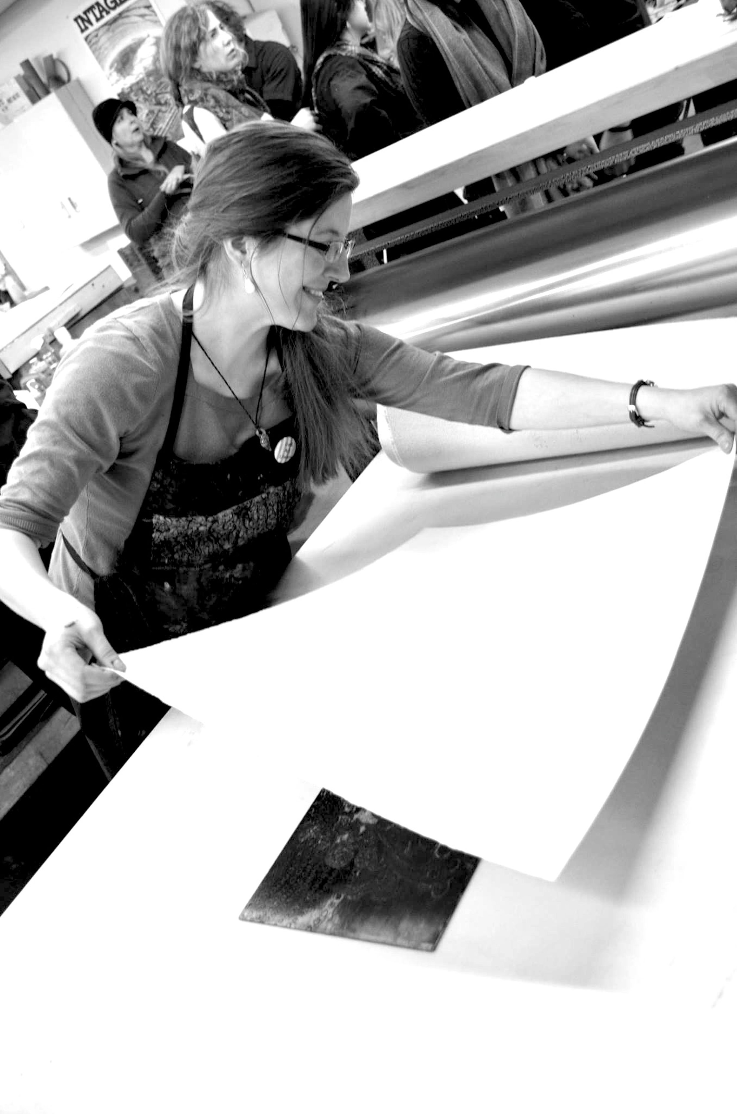
A photograph of Singel at work in her studio.

A photograph of Singel at work in her studio.

The line as an element in art is often taken for granted. The common layperson’s observation that “I can’t even draw a straight line,” betrays a common misunderstanding about how an artist approaches line. When an artist wants to draw a straight line, they pick up a ruler, but a line has so much more potential. Printmaker Rachel Singel thoughtfully explores the linear in her work: “Lines are the building block of my world. The printmaking process allows for a technical consideration of how these lines are distributed throughout the work, with the weight of each line relating directly to how much time it etches. Their physical qualities carry weight; they do not descend into the paper but protrude from the surface.” 

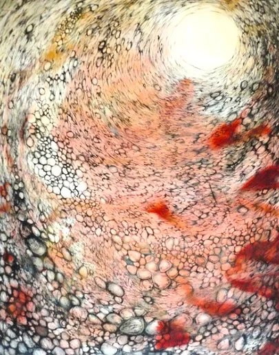
If that explanation sounds academic, it fairly reflects the intellectual aspect of the printmaking process as well as Singel’s position as Assistant Professor at University of Louisville’s Hite Art Institute, but her lines also describe recognizable forms in nature, and in Venetian Vortex, there is a discovery of the hallucinatory character that can be found in the natural world, and line works in concert with scant patches of color to move into the realm of the abstract.

“Venetian Vortex” by Rachel Singel, 56x72in, intaglio on cotton paper (2013)

“Venetian Vortex” by Rachel Singel, 56x72in, intaglio on cotton paper (2013)

“Lines develop into curves, from curves to semi-circles, and from semi-circles to the full circle. This stylistic tendency comes from my interest in openings in nature—those places around which nature’s complex forms develop. Close studies of natural objects reveal holes in their surfaces. The space is a source of weight—a fulcrum point that seizes my attention by giving the illusion of an even deeper space, seeming to recede to infinity. The lines radiate out from these seeming voids—the starting points for infinite variation within the work.”

Singel was one of the organizers of the October 2016 Mid America Print Conference hosted by Indiana University Southeast and The University of Louisville. Her work was featured in an exhibit with Susan Moffett, Marilyn Whitesell, Mary Lou Hess, Susanna Crum, and Susan Harrison.

Singel was also selected to participate in the Mid-America Print Council Members Juried Exhibition at the Carnegie Center for Art and History, October 2016.

Singel currently is co-curating a group exhibition at Asheville Bookworks. She has exhibited internationally in Venice, China, Korea, Chile, Japan, Slovenia, Bulgaria, and the United Arab Emirates, and her work is included in 2016 Literary Innovation: A Juried National Exhibition Inspired by William Faulkner and Ernest Hemingway at the Catapult Gallery in Cape Girardeau, MO, through November 27, 2016, and in Points of Departure: An Exhibition without Borders, at the John Michael Kohler Arts Center on Sheboygan, WI through January 15, 2017.

“Seed Pods” by Rachel Singel, 18x20in, intaglio on mulberry paper (2015)

“Seed Pods” by Rachel Singel, 18x20in, intaglio on mulberry paper (2015)

In Louisville, you can next view Singel’s work in The Art and Architecture of the Jewish Ghetto in Venice, Italy, The Jewish Community Center, Louisville KY, January 15-February 21, 2017. 

Permanent Collections (selected)

Tipoteca Italiana Archives, Cornuda, IT
Jewish Museum of Venice, Venice, IT
Baylor University Libraries, Waco, TX
Avery Architecture and Fine Arts Library, Columbia University, New York, NY
University of Denver Special Collections & Archives, Denver, CO
DePaul University Special Collections & Archives, Chicago, IL
Stanford University Special Collections & University Archives, Stanford, CA
Artist Books Collection, University of Louisville, Louisville, KY
SGCI Archives, Pacific NW College of Art and Portland State University, OR
John C. Hodges Library Special Collections. University of Tennessee, Knoxville, TN
Guanlan International Print Biennial, Shenzhen, China
Permanent Collection Christchurch Polytechnic Institute of Technology, Christchurch, New Zealand
Proyecto´ace Print Collection, Buenos Aires, Argentina
Venice Printmaking Studio Print Collection, Venice, IT
Indiana University Print Collection, Bloomington, IN
University of New Mexico Print Collection, Albuquerque, NM
Pyramid Atlantic Art Center Print Collection, Silver Springs, MD

Age: 29
Hometown: Louisville, Kentucky
Education: MFA, University of Iowa, 2013 BA, University of Virginia, 2009
Website: http://www.rachelsingel.com

“Exploding Flower” by Rachel Singel, 16x20in, intaglio on handmade cotton paper (2015)

“Exploding Flower” by Rachel Singel, 16x20in, intaglio on handmade cotton paper (2015)

Are you interested in being on Artebella? Click here to learn more.

Written by Keith Waits. Entire contents copyright © 2016 Louisville Visual Art. All rights reserved.

Advertise on Artebella! Click here for more information.

Advertise on Artebella! Click here for more information.