graphic design

Photography

Vignette: Steve Squall


"Wabi-sabi is the quintessential Japanese aesthetic. It is a beauty of things imperfect, impermanent, and incomplete. It is a beauty of things modest and humble. It is a beauty of things unconventional..." — Leonard Koren


Photographer, Steve Squall

Photographer, Steve Squall

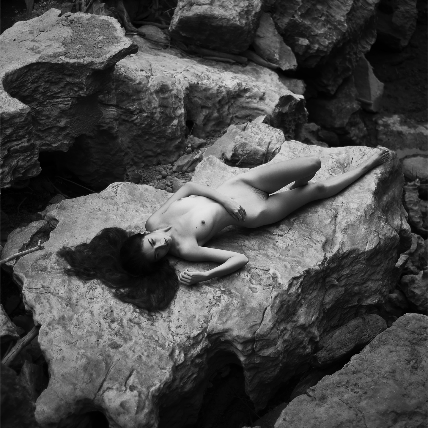
Photographer Steve Squall’s images luxuriously embrace old school Black & White tonalities and the now-rare use of nude models in nature. As an artist, he is seeking to reconnect to the fundamentals, an intention driven by a specific, almost spiritual motivation.

“My current body of work focuses on the female form with an emphasis on the Japanese aesthetic philosophy of Wabi-Sabi,” explains Squall. “The images focus on simplicity in execution, embracing spontaneity - the ‘happy accident’, and finding the beauty in imperfection. It's largely a reaction to the highly produced work that I do for a living that often requires an entire team of creatives, heavy attention to detail, and a sizable amount of equipment to create.”  

"Kasho" by by Steve Squall, 20x20in, photograph (2016), $350 | BUY NOW

"Kasho" by by Steve Squall, 20x20in, photograph (2016), $350 | BUY NOW

“Allowing myself to simply walk into a setting with nothing but a camera body, a single lens, a model, and just exploring while stopping to shoot when we find interesting scenes or stunning natural light has been quite a freeing experience. The work has helped me to rediscover the simple joy of just taking a photo without having a jumble of variables running through my head. It's reminiscent of the feeling I got so hooked on when I first picked up a camera and would just point it at whatever I thought looked interesting without worrying about too much else.”

"Wabi-Sabi Portfolio No. 1" by by Steve Squall, 810in, photographs (2016), $350 | BUY NOW

"Wabi-Sabi Portfolio No. 1" by by Steve Squall, 810in, photographs (2016), $350 | BUY NOW

Squall’s images are classic in their juxtaposition of the soft human flesh against the stark and harsh textures of the elements. A woman stretched out across a large rock, her hair spread across the surface, is a formal study in contrasting textures, but also a suggestion of humankind in relationship to the environment, the artificial raiment of society discarded but the exposed flesh separated from nature by a vulnerability that cannot be so easily erased.

“I liken the experience to the famous quote attributed to Picasso: "It took me four years to paint like Raphael, but a lifetime to paint like a child." Well, it took me more than four years to photograph like a pro, and now I'm learning how to photograph like a child.”

Hometown: Shively, Kentucky
Education: BA in Graphic Design, Indiana University Southeast, 2009.
Website: www.stevesquall.com

"Cassandra No. 1" by by Steve Squall, 20x26in, photograph (2016), $350 | BUY NOW

"Cassandra No. 1" by by Steve Squall, 20x26in, photograph (2016), $350 | BUY NOW

"Enso" by by Steve Squall, 20x20in, photograph (2016), $350 | BUY NOW

"Enso" by by Steve Squall, 20x20in, photograph (2016), $350 | BUY NOW

Written by Keith Waits. Entire contents copyright © 2017 Louisville Visual Art. All rights reserved.

Are you interested in being on Artebella? Click here to learn more.
Are you interested in being on Artebella? Click here to learn more.

Painting

Vignette: Barry Burcaw

Burcaw standing next to one of his sold paintings.

Burcaw standing next to one of his sold paintings.

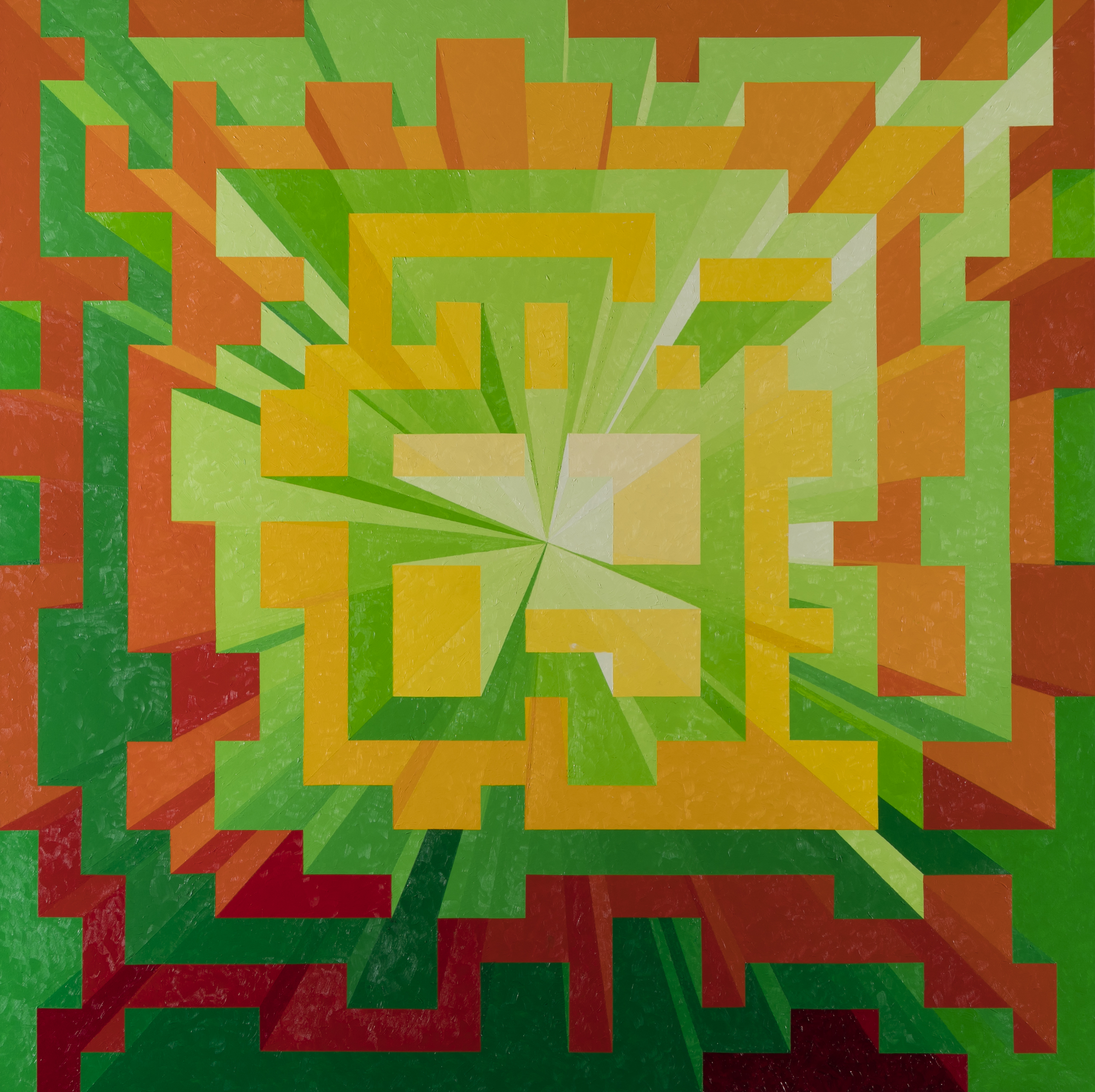
Geometry is the mathematical method of understanding specific spatial relationships and forms through numbers. Humankind requires it to build the society they occupy, but is also can be applied to less concrete forms, such as the construction of music. In the paintings of Barry Burcaw, architectural vistas are rendering in abstract terms that are schematically precise, but the structures don’t seem bound to bedrock.

The connecting forms could be the levels of skyscrapers stretching out to the far horizon while simultaneously obscuring that line, but Burcaw cites music as an influence as well, so that one is forced to ponder the shapes and forms as elements within a symphony; layers of notes and phrases meticulously constructed on the page in an academic method. Yet, when played, the score lifts away from the cold, analysis of the blueprint to become something that feels organic and heightened. Musical and visual harmony become metaphorical companions as Burcaw’s strategy with color and composition do the same for the viewer.

"Blue Plateaus" by Barry Burcaw, 50 x 50in, oil on canvas (2016)

"Blue Plateaus" by Barry Burcaw, 50 x 50in, oil on canvas (2016)

Burcaw recently exhibited work at Jenkins Eliason Interiors.  He is now preparing to offer a selection of his paintings as giclee reproductions. Burcaw paints on a large scale, and he hopes making them available on a different scale will be a smart marketing choice. “I have realized that if the price of an original isn't a problem the size often is and vice versa.”

Hometown: Palisades, New York
Age: 73
Education: BS in Graphic Design, University of Bridgeport, CT

"Vanishing Point" by Barry Burcaw, 50 x 50in, oil on canvas (2016), $3200 | BUY NOW

"Vanishing Point" by Barry Burcaw, 50 x 50in, oil on canvas (2016), $3200 | BUY NOW

"Global Warming" by Barry Burcaw, 50 x 50in, oil on canvas (2016), $2800 | BUY NOW

"Global Warming" by Barry Burcaw, 50 x 50in, oil on canvas (2016), $2800 | BUY NOW

"Parthenon" by Barry Burcaw, 50 x 50in, oil on canvas (2016), $4500 | BUY NOW

"Parthenon" by Barry Burcaw, 50 x 50in, oil on canvas (2016), $4500 | BUY NOW

Written by Keith Waits. Entire contents copyright © 2017 Louisville Visual Art. All rights reserved.

Are you interested in being on Artebella? Click here to learn more.

Are you interested in being on Artebella? Click here to learn more.

Illustration

Q&A: Jeff Dehut

Jeff Dehut is a freelance Illustrator working in Louisville, KY specializing in tabletop game design and portraits using traditional mediums such as pen and ink, and watercolor. He is the creator of Pocket Dungeon Quest, a simplified, casual rogue-like tabletop adventure for 2-4 players.

When did you first think you would be an artist?

It was when I was just a small boy. I would sit at home after school and draw comics all afternoon. I knew I wanted to get into art somehow. At that time my thoughts were either as a comic book artist, or concept work for movies and games.

Who or what inspires you now?

I absolutely love Wesley Burt’s style; I could look at his sketches all day. I also love looking at concept art books of any kind.

If you could do anything else but make art, what would it be?

I would probably have to say making coffee. I just love everything about the coffee-making process.

"Homes" by Jeff Dehut, 8x8in, micron pen (2016)

"Homes" by Jeff Dehut, 8x8in, micron pen (2016)

What frightens you the most?

Getting stuck at a job that drains me creatively.

"Enjoy the Little Things" by Jeff Dehut, 8x8in, digital (2017)

"Enjoy the Little Things" by Jeff Dehut, 8x8in, digital (2017)

What is your favorite music to listen to when making art?

Typically I listen to documentaries about various things, or audiobooks of all kinds. When I listen to actual music, it’s usually soundtracks or instrumental so I can focus on other things at the same time.

Vinyl or CD?

Neither. Digital.

Favorite movie?

Star Wars, IV, V & VI.

What are you reading right now?

Ha. I just finished the Magnolia Story, it was a super cute book.

What advice would you give a young artist just out of college?

Don’t wait for jobs to come to you. Go get a job - of any kind. Go make your own creative projects while you wait for something creative to turn up. Be proactive. Make the kind of work on your own while you’re not getting paid for it so that when a company is willing to pay someone for it you can be first in line with experience. Go! Do!

"Illustration Samples" by Jeff Dehut, 3.5x2.5in, ink & marker (2017)

"Illustration Samples" by Jeff Dehut, 3.5x2.5in, ink & marker (2017)

Tell us about an important moment of transition for you as an artist?

The moment I lost my first salary job. It forced me into freelance for a while which forced me to learn many valuable skills I would not have otherwise acquired.

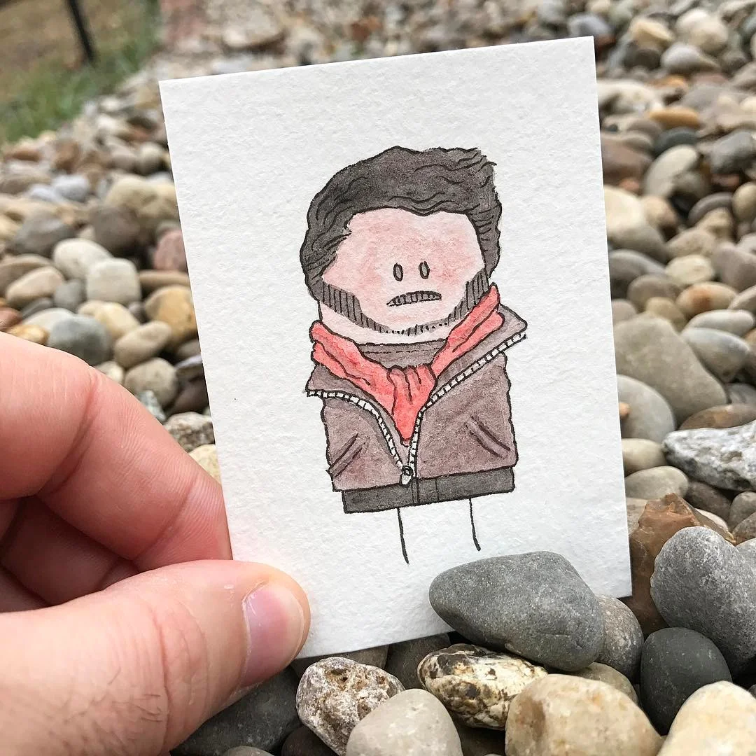
"Watercolor Thumb People" by Jeff Dehut, 3.5x2.5in, watercolor & micron pen (2017)

"Watercolor Thumb People" by Jeff Dehut, 3.5x2.5in, watercolor & micron pen (2017)

If you were given a $100,000 what would do with it?

Get a studio of some kind so I could finally unpack all of my art supplies and make bigger work.

What does art mean to you?

This is a huge question... Art is something you create - for me it is usually, to some extent, emotionally charged, and I hope my art makes other people feel that way. Usually I want people to feel happy to see my work.

What do you feel is your greatest flaw?

I typically bite off more than I can chew. I’m getting better at it…kinda.

If you could have a talent that you currently don't already have what would it be and why?

I want to learn about more art mediums or techniques because I always want to learn more about my craft.

If you could meet any celebrity who would it be and what would you ask them?

I would like to get a photo with Enrico Colantoni because I loved him in Galaxy Quest and I think we look very similar. It would be funny!

Does art have a purpose? If so, what is it?

Oh boy. I think it does. The purpose of my art is to make others feel encouraged to be better people.

Hometown: Louisville, Kentucky
Age: 36
Education: Associates in Graphic Design with a specialty in Photography
Social Media: https://www.instagram.com/explosivelimes/

"Watercolor Faces" by Jeff Dehut, 8.5x11in, watercolor & micron pen (2016)

"Watercolor Faces" by Jeff Dehut, 8.5x11in, watercolor & micron pen (2016)

Entire contents copyright © 2016 Louisville Visual Art. All rights reserved. 

Are you interested in being on Artebella? Click here to learn more.
Are you interested in being on Artebella? Click here to learn more.

Photography

Vignette: Violet Herrmann

"Faces" (set of 2) by Violet Herrmann, 10x16in, photograph (2014)

"Faces" (set of 2) by Violet Herrmann, 10x16in, photograph (2014)

As a photographer and a designer, Violet Herrmann states she is, “…a firm believer in simplicity with a bold hint.” In “Mellwood,” her photograph reads at first glance as a captured ‘snapshot’ – a random glimpse of a passing moment, yet the cool, evening shades of blue are seductive, and there is tantalizing mystery in the dramatic depth found in the contrasting channels of space. It would all be a solid, albeit academic composition except for the hesitant figure on the right, leading us further into the scene but arresting that momentum by turning on their heel. It is the key to lifting the image beyond the ordinary.

All of which reflects the idea that good composition and design is a series of relationships, most of which might never register fully with the viewer, but will have undeniable impact on how a piece is read. Herrmann explains, “I believe that the best designs appear to have their components distributed randomly throughout the page; but one finds that every element is aligned to another found in the piece.”

"Mellwood" by Violet Herrmann, 17x11in, photograph (2016)

"Mellwood" by Violet Herrmann, 17x11in, photograph (2016)

“My work describes me as an artist as well as a person. As a stubborn perfectionist, my designs reflect my personality by carefully placing components in relation to one another while maintaining an edginess that makes them unique. I believe that a design must ultimately speak for itself to be considered truly successful. If I have done a good job on my work, my personality should be able to shine through and reflect me as a designer.”

Herrmann has worked as a Graphic Design Intern for Simon Signs in Louisville Kentucky and her work has been displayed in the Kentucky College of Art and Design (KyCAD) Gala in the 849 Gallery, Louisville Kentucky. While at KyCAD she was awarded the Presidential Scholarship.

Hometown: Charlestown, Indiana
Age: 21
Education: BFA candidate, General Fine Arts, Kentucky College of Art + Design at Spalding University, Louisville Kentucky

"Louisville Door Series" (1 of 12) by Violet Herrmann, 10x10in, photograph (2014)

"Louisville Door Series" (1 of 12) by Violet Herrmann, 10x10in, photograph (2014)

Written by Keith Waits. Entire contents copyright © 2016 Louisville Visual Art. All rights reserved.

Are you interested in being on Artebella? Click here to learn more.

Are you interested in being on Artebella? Click here to learn more.

Digital, Illustration

Q&A: Monica Beavers


“Rabbits are a lot smarter and tougher than most people give them credit for.”
– Monica Laake Beavers


"Big, Brown Bunny That Can't (Won't) Hop" by Monica Beavers, 8x10in, mixed media/illustrated book (2016)

"Big, Brown Bunny That Can't (Won't) Hop" by Monica Beavers, 8x10in, mixed media/illustrated book (2016)

Monica Laake Beavers was born and raised in the rolling hills of Northern Kentucky. She has always had a love for art and believes creativity is the spice of life. Monica received her Bachelor of Fine Arts degree, focusing in Graphic Design & Drawing, from Xavier University, and was at one time the Design Coordinator for Louisville Visual Art. She recently finished writing and illustrating her second children's book, "The Big, Brown Bunny Huh?".

When did you first think you would be an artist?

I’m pretty sure I was in kindergarten. The teacher pretty much wasn’t able to take the pencil away from me. I just kept drawing rabbits on everything – my fascination with rabbits started very young.

Who or what inspires you now?

My main inspirations are:

  • Walt Disney: say what you will about him, but I’ve always been a Disney kid from an early age. I respect his creative genius, ambition and persistence he carried throughout his career. He failed so many times early on in his career, but he kept on going. 
  • Movies, specifically Indiana Jones. I want my art to be able to force people to take a breather from the seriousness and monotony of life and just enjoy a moment, even if it’s fleeting. 
  • Saul Bass inspires me artistically. (Bass 1920 – 1996) was an American graphic designer and Academy Award-winning filmmaker, best known for his design of motion-picture title sequencesfilm posters, and corporate logos). He always focused on the communication of design and art. He was able to take complex opening scenes to films and simplify them to their bare minimum. When creating my books, I’ll try to start with a complex idea and try to simplistically break it down using a rabbit or other animals to typically convey the message in a lighthearted manner.
  • I’m very much fueled by quotes as well, specifically Charles Bukowski and Rudyard Kipling. 
Website_Pages_RGB-01.jpg

Why rabbits? Tell us about the real-life “Bun.”

The bun, the myth, the legend! I’ve loved rabbits as long as I can remember. 

I chose rabbits because of my own pet rabbit, Grumpy, as well as my love for personification. Grumpy has a unique personality and had a very rough upbringing. I wanted to bring this personality to life. Grumpy may appear crotchety and not very trusting of those who first meet him, but he has a heart of gold! 

Grumpy, aka “Bertie McBean” (his stage name for the books), is a French lop by nature and a bunny jam packed with disdain. Hailing from Cleveland, OH, he was saved from a hoarding situation and relocated to Indyclaw Rescue in Indianapolis, IN. One fateful day, he was adopted by a lady (me!) and meandered to Louisville, KY. His knack for traveling and zest for life blew him upstream to Bellevue, KY where he currently resides. He is a free-range rabbit who loves acoustic music (especially Eddie Vedder), the smell of feet, and apples.

You also are heavily into sharks, and there is at least one shark painting on your website. These two animals wouldn’t seem to be a natural match, yet they dominate your unique sensibility. Why is that?

I think from both sides of the spectrum, they are extremely misunderstood animals and ridiculously interesting. Rabbits are a lot smarter and tougher than most people give them credit for. They have a lot of admirable qualities and unique habits (thumping, chinning, binkying, etc.). On the shark end, I’ve always been fascinated knowing they have been in existence practically since the beginning of time and yet have never had to evolve nearly as much as most animals have. Again, they are extremely misunderstood animals but carry a very weighty reputation. 

Additionally, both animals have such unique characteristics they’re a lot of fun to play around with and personify. 

You can draw and paint old school, but why do the two books you have published rely on computer graphics? 

I think this stems from my college Graphic Design professor Jonathan Gibson. He very much emphasized the importance of keeping a human touch when creating a design piece. He stressed the importance of texture and use of mixed media when designing. Too often people rely on a computer to create textures/effects and as a result, a lot of art can begin to look monotonous and generic and lack personality. 

"Big, Brown Bunny That Can't (Won't) Hop" by Monica Beavers, book marks, mixed media/illustrated book (2016)

"Big, Brown Bunny That Can't (Won't) Hop" by Monica Beavers, book marks, mixed media/illustrated book (2016)

My love of art began with drawing and transitioned into graphic design, but I like to use the two interchangeably. When creating my illustrations, I actually start by sketching them all out on a notepad. I then take photographs of textures that have personal meaning to me. For example, I’m a Red’s fan, so a lot of the grass used is from the Red’s stadium. Additionally, the furs used for Grumpy/Bertie McBean are actual photographs of his fur.

Additionally, depending on the project I first start with the idea and what my main message is. From there I select the medium to work in accordance to the theme of the piece. My current style wouldn’t necessarily be used if the message were different. I felt like this style captured the personality of Bertie McBean and what I was trying to convey. 

If you could do anything else but make art, what would it be?

I would be a marine biologist or zoologist, travel the world and study sharks.

What frightens you the most?

I hate caterpillars - really, …I do. In all seriousness though, my biggest fear is losing the ones I love the most and not following my dreams and looking back years from now and asking “what if…?”

What challenges you more than anything?

The question “what if?”

What is your favorite music to listen to when making art?

I typically mix it up between Eddie Vedder/Pearl Jam, Pokey LaFarge, Jim Croce, or the Eagles. 

I usually listen to pretty chill music when making art. I’ve been listening to the Into the Wild soundtrack a lot lately.

Favorite movie? Besides Jaws, that is?

Ha! I think, “I’m going to need a bigger boat” for that question (wokka wokka). Although it is hard to beat, Indiana Jones & the Last Crusade is my favorite. In my eyes, it’s the perfect storyline and end to a trilogy (the fourth movie didn’t happen). It includes a just the right amount of campiness, wit and quirk that separates it from a standard action/adventure movie.

What are you reading right now?

I’m in between three books, “Ham on Rye” by Charles Bukowski, “A Separate Peace” by John Knowles, and David Sedaris’ “Chipmunk Seeks Squirrel.”

What advice would you give a young artist just out of college?

Don’t get frustrated. Each path and experience will lead you where you want to be as long as you don’t lose sight of where you intend to go. After graduating you leave feeling like you’re on top of the world and reality starts to sink in with work, but remember, you chose art for a reason. You always have options and you chose art because you didn’t want a boring life.

If you were given a $100,000 what would do with it?

Start my own company full time and work on branding The Big, Brown Bunny. Start up my own rabbit rescue and probably travel to Egypt, Greece or South Africa- great shark diving area.

What does art mean to you?

Art means happiness. It’s my escape. It allows me to take a break from the real world and just create. It means taking a closer look at things and not accepting things as they are, it means endless possibilities.

If you could meet any celebrity who would it be and what would you ask them?

Walt Disney – What inspired you? What would you hope people remembered you for? What kept you going on the hard days? 

Harrison Ford – I would have to ask about Indiana Jones.

Hometown: Villa Hills, Kentucky
Age: 28
Education: BFA, Xavier University
Website: http://www.bigbrownbun.com

"Big Brown Huh?" by Monica Beavers, 8x10in, mixed media/illustrated book (2015)

"Big Brown Huh?" by Monica Beavers, 8x10in, mixed media/illustrated book (2015)

Bunny+Pages-01_2.jpg

Entire contents copyright © 2016 Louisville Visual Art. All rights reserved.

Are you interested in being on Artebella? Click here to learn more.

Are you interested in being on Artebella? Click here to learn more.